Customised Excel reporting with Qlik
Everyone involved in a business needs information to help them conduct their role. In many cases this is simply data related to the process that they implement. Sometimes the data may be a little complicated, but it doesn’t require any analysing to be used.
Examples could include:
AP manager needs a summary of supplier invoices that are open and their due dates.
Credit Manager needs a list of customers that have hit their credit limits based on amounts and timeframes.
Warehouse manager needs a simple report that provides stock items that have backorders and nothing incoming in the next week.
Sales Manager wants a daily email of sales person totals for the previous day along with a history for each person for the last three months.
Solutions
There are a number of ways to provide solutions to these needs. Many ERP systems have built in reports that can be scheduled with this information, but most organisations tend to have something custom that they may need. For instance, in one organisation you may want to see sales of a certain class of item as part of your sales person daily summary.
Using Qlik Sense Enterprise SaaS you can build a report using an Excel template to pull information from a Qlik app, have it filtered appropriately for the recipient and formatted using the full suite of tools available in Excel.
Qlik Sense Reporting requires two inputs, a spreadsheet or other source of recipients and appropriate filters, and a report template which is an Excel file. The template is uploaded into the Qlik app and then report tasks can be created an scheduled.
Sample Case – Customer Debt Management
To see how it all fits together, we’ll walk through a sample case. Lets assume that we want to get better visibility of our customer debt. We have a salesperson assigned to each customer and we want to send them a report every week of their customers and the debt ageing.
In Qlik we have built a debt ageing app with detail of the outstanding invoices and when they were issued. The first step is to define the problem we are trying to solve. In this case it is:
We have a lot of open unpaid customer invoices. Our sales staff have a better rapport with the customers and having a debt discussion that includes them will be beneficial when making decisions about these invoices.
Based on this problem description, we wish to generate a weekly report to the sales staff as a background to a meeting with the recovery department. The next task is to define the nature of the information that will help the sales staff during that conversation. We come up with some elements to include
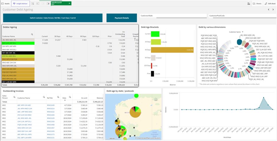
A list of customers showing their debt amount by age groups
Highlight the ones with old debt by colour
Include an overall outstanding amount by considering unapplied payments – this avoids problems with the customer saying they have paid, but we haven’t applied it.
Include a summary chart to give the breakdown by debt age (ie how much of their debt is quite old).
Use colour codes to make the debt age clearer.
Show a map with the debt breakup by state or postcode.
Let’s assume this information is already presented in a Qlik app ready for consumption in a report. Perhaps it looks like this:
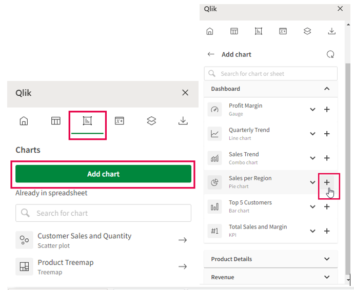
The next step in the process is to design our report in Excel. We can create an Excel app and then using the Qlik Excel add-in, we can add any of the tables or charts from the sheet into our report template.
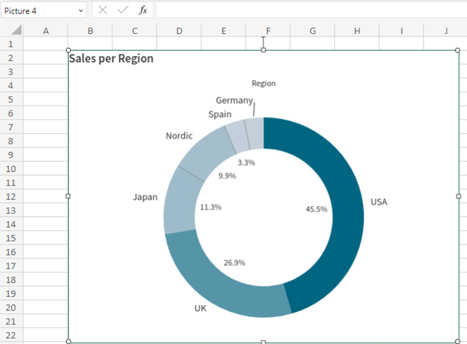
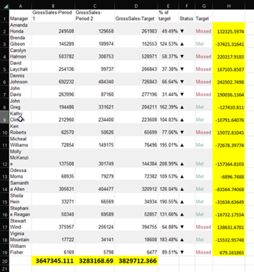
The resulting table or chart can then be used in the same way as any Excel content. For instance, if you add a table, you can have a total row at the bottom with formulas:
Once the report template is complete, you can upload it into the Qlik reports section of the app as a new template. Then you can setup report tasks to send reports to recipients or recipient groups as required.
So, here is our Excel report using this template filtered for sales person John.
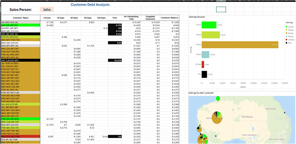
We can now upload this template and setup up report tasks with filters to send John and the other sales staff their report each week.
If the sales staff had a Qlik licence, we could add a link to the sheet in the report so they can jump straight to it and interactively investigate the data.
Use Cases
As you can see this works pretty well for things like a weekly reminder of your outstanding invoices, but what else can we do with Qlik Tabular reports. Here are a few use cases that we have worked on:
Daily list of overdue POs with history of recent purchases delay from each supplier involved
Sales KPI report to state sales mangers on total weekly sales Vs same week previous year, compared to budget, top customers, sales staff weekly summary
Warehouse Manager Low stock report. List of stock items predicted to hit OOS (Out Of stock) in the coming week. Along with history of time between PO and delivery for each stock item
Weekly Job cost summary for job managers. Including different sets of cost types and how it is tracking to budget.
Financial P&L progress report to financial controller
Summary
We are all used to reports as the backbone of information overview for our businesses. In the age of powerful BI tools such as Qlik, these can be powered up to give the details needed to deal with the problems behind the need for the reports.
If you would like more information on using Qlik, please contact your support consultant.
