The roster has a sleek new look that helps managers visualise performance and make more informed decisions. All of the roster's essential functions are the same, but items are now grouped in a more logical way. These changes make the roster is easier to navigate, quicker to edit, more responsive and more accessible.
Top menu
The menu at the top of the roster consists of a top row and a bottom row:
Top row
The top row contains all the key key tools combined into a group on the left and a group on the right.
Left group
-
Group the roster—By employee, location, position or cost centre.
-
Select the period—Choose to view by day, week or month.
-
Pick the date—This option was previously located in the centre.
-
Bar chart button (

Right group
-
Plus button (

-
Copy button (

-
Paintbrush button (


-
Currency button (

-
Graph button (

-
Funnel button (

-
Ellipsis button (

-
Publish button—Publishes your roster.
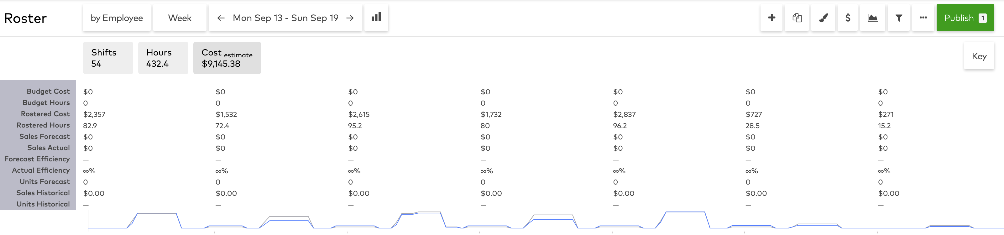
Bottom row
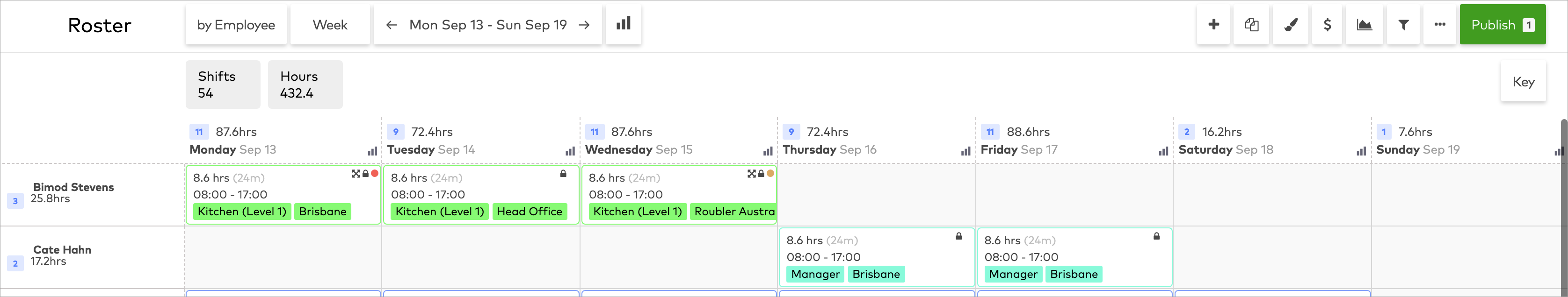
By default, the bottom row contains the shifts and hours summary by default.
You can also display the graph and/or table breakdown and costing summary here by clicking the Graph button (
Shift tiles
Changes have also been made to shift tiles.
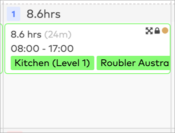
-
The block colouring has been removed to make the interface cleaner, lighter and easier to process.
-
Role types are now highlighted with colour rather than blocking out the entire tile.
-
The tile border is also highlighted with the colour to match the role type.
-
The status colour bar has been reshaped to a circle and repositioned to the top right-hand corner to create white space and a cleaner tile.
-
The length of an employee's break is now listed within brackets next to the total length of the shift.
-
Shifts that can be dragged and dropped now have a dedicated crossed arrows icon (
